How could Marks & Spencer improve its website? The web developer’s view

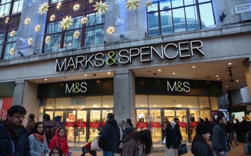
Marks & Spencer announced today that the new M&S website has failed to perform, with a fall in online sales of 8.1 per cent, and with the development project going over budget by 50 per cent.
Since the new site launched in February, customers have taken to the company's Facebook page, Twitter and web forums to voice their dissatisfaction with the site. Five months on, the complaints haven't let up. So what could M&S do to make their website better?
1. Don't force customers to re-register
This ship may have sailed, but by far the biggest mistake was to ask every customer to re-register for the new website. Even if they have to reset their password when they first login, and even if their order history on the old website is not preserved, those options would be better than nothing.
However, it may be out of the company's hands, as the previous site used the Amazon platform – and Amazon might not provide an export of customer data. But if it was possible to grab all of the email addresses from Amazon, there's no technical reason why those email addresses couldn't be "pre-registered" on the new site.
2. Get search to display accurate results
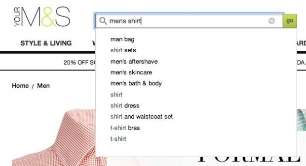
Search for a product is unpredictable. For instance, typing "mens" displays an autocomplete drop down with "Man Bag" listed first (which just isn't me). I then continued typing so I had "mens shirts" in the search box, but the results didn't seem to update. Hitting Enter to search for "mens shirts" displayed a Spider-Man T-Shirt and a Mr. Men T-Shirt at the top of the results.
Search is something that takes time to get right, but in this case, the results were a long way from what I was expecting. If customers can't find the products they want, how can they buy them?
3. Improve the site speed, especially on mobile
All too often I was presented with a "loading" screen for several seconds – particularly on mobile. A couple of the things that did this include:
- the "hamburger" icon in the top-left of the mobile site – when clicked, this displays a menu (eventually)
- changing the quantity of items already added to "your bag"
4. Tone down the feedback popup
After searching for a product, a feedback popup appeared. On mobile, this is really intrusive as it covers the entire page. It would be much better to only show the feedback popup at the end of the process, as right now it interrupts the sales flow. This may cause customers to drop off very early in the process.
5. Rework the filters and categories
Filters are good as you can choose several options to drill down and find what you want. But once you choose a category, you can't de-select it. Worse still, choosing a category when I didn't already have one selected leads to all of my filters being lost without warning.
6. Simplify registration
When clicking the Checkout button, I end up on the registration page. As I don't have an account yet, my instinct is to click "No, I don't have an account". I then cannot click Continue. It took me a moment to realise I have to enter my email first.
Why not take the choice away from the user? Ask for the email address without showing any other options. Then you can tell me if I have an account or not. If I do, "welcome back Ben – please enter your password" – otherwise, ask me to sign up.

7. Be consistent with the phone number requirement
During registration I was asked for a phone number and said it was optional. So I left it blank. When I enter a delivery address at checkout, the phone number field now says "this field is required". Totally confusing. Why not drop the phone number at registration and only ask for it if you need it?
8. General problems with the ease of use
It's hard to pinpoint just one issue that would make the website easier to use. So here are a few things:
- If I'm not logged in, "Save for later" just deletes the item without warning me first.
- When choosing a size on a product that only has one colour, the size option says "Please select a colour Size: 16".
- The buttons "Product" and "On model" don't appear to do anything.
- Why add a Back button in the mobile site when you can just click Back in your browser?
- On the desktop site, the icon used for deleting a filter looks like a "refresh" icon. It should be an "x".
- The top "Your Account" menu should be clickable, instead of having to drill down to "Your Account" and then "Go to your account".
- "Free delivery – to a store" should probably be called "Free collection" or similar. As it says you get free delivery for orders over £50, then it says free delivery (but to a store) if you spend under £50.
- When searching for products, I kept seeing items that are out of stock.